A Crash Course in Responsive Design
Did you notice that I've re-written all the CSS for this site? Possibly not. After all it should look just the same. You'd only notice a change if you visit from a mobile device or resize your desktop browser down real small.
If you were to shrink your browser down it would look like this:

The site has responded to this size change by altering the layout and making only the most important parts immediately visible. This is what's called Responsive Web Design!
How To Be Responsive
Let's look again at the website I mentioned last week, as seen on the browser on my smartphone (an S3). As you can see it's less than ideal:
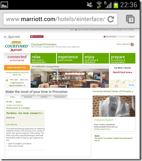
What the browser has done is rendered the site normally and than shrank it down to fit the phone's screen. That's why it looks all cutesy and small.
If you're going to use responsive design the first thing you need to do is tell the browser not to render a shrank-down version of it. To do this you add the following HTML to your <head> tag on all page:
<meta name="viewport" content="initial-scale=1.0,width=device-width" />
Do this and then take another look at your website on a small device. You should see where it needs works.
All we need to do is tweak the CSS to change the layout to fit the screen (now that the phone isn't automatically doing that for us). To do this we add a series of @media queries to the existing CSS.
Here's a very simple example of using a responsive @media query:
body{
    margin:5%;
}

@media screen and (max-width:480px){
  body{
    margin:0;
  }
}
The above CSS says that by default (and on all browsers that don't support responsive queries) the body of the page has a margin of 5% of the page width. However, when the page width drops below 480px the margin is removed.
Simple, no? That's pretty much all you need to know. You just apply the same tricks and principle in a similar way for lots of other screen sizes.
Here's a very simple example page.
Getting More Advanced
The example above is about as simple as I could make it. I just wanted to demonstrate the very basic principle involved. There are a few other selectors available to use in your queries. The list you need to know about are:
- max-width
- min-width
- max-device-width
- min-device-width
- device-orientation
Using the max-device-width you could rewrite the above CSS like so:
@media screen and (max-device-width:480px)
The difference here would be that resizing your desktop browser to <480px would have no effect, as the max-device-width is always the size of your monitor. However, it would still have the desired effect on a smartphone with a screen width of 480px.
You can use min and max selectors together to target a specific range of widths. Like so:
@media screen and (min-width:768px and max-width:1024px)
The above query would apply CSS to browsers with widths between the two sizes.
Using device-orientation you can tailor your site to deal with changes in orientation of smaller devices.
@media screen and (max-device-width:480px and device-orientation:landscape)
This would only apply the styles on small screen held in landscape mode. You could get clever here and re-layout any forms to take advantage of the screen space - for example by making forms two columns wide instead of one.
Take It Seriously?
Don't think it's worth taking seriously? Microsoft do! Here's the preview of the new responsive homepage they're working on.
In the future all sites will be designed this way (or at least that's what I believe). Do yourself a favour and get on the ladder now. Start by reading this book. You'll be glad you did.
In the next post I'll try and produce a more real-world, but easy to digest example.
 Skip to the
  You can subscribe to an individual
Nice explain for beginners. I believe that Responsive Design is the direction to go with web site and web application. The planning process is critical to the success.
Reply
explanation not explain
Reply
Thanks Jake, makes a lot of sense.
But the header to each article is a little different :)
Reply