Responding To Changes In The Web
I now do a lot of web browsing on mobile devices (smartphones / tablets) as, I'm sure, do you.
It's inarguable that this trend toward mobile browsing won't increase. Despite this, what I've found is that the majority of websites just do not work well on small screens.
Well, ok, they "work" but they don't work!
Consider the following screenshot of how the website for the hotel I'm staying in looks in Chrome on my Galaxy S3:

Now, you might be thinking "Huh? It looks fine, what's up with that?". Well, yeah, it "works", in that it's a cute little miniaturized version of what you'd expect to see on a PC. But does it actually work, really? Can you read the text without zooming in? Can you perform the primary functions of the site easily? Try to actually use this website on a small screen and you'll soon be calling out in despair.
Now, consider the following two screenshots, both taken on the same Galaxy S3:
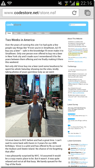
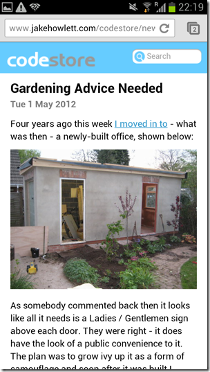
Which do you find the easiest to look at? I'm hoping the second one!? The first is how this site currently looks. The other is how I'm proposing it looks. It's a work-in-progress prototype of a new responsive design for this site.
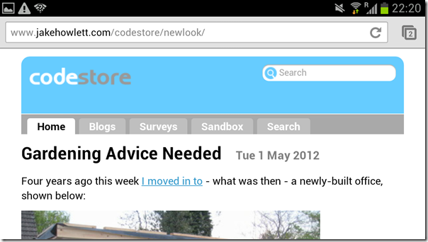
Here's the same page on the same device but in landscape mode. It then takes advantage of the extra width available:
Here's the same page, but on a desktop and at a much larger window size (>1200px):
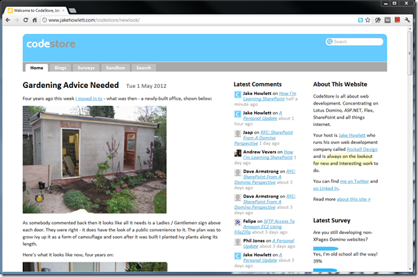
In the shot above the site now makes much better use of available screen width by switching to a 3 column layout.
Shrinking the browser down a little and the third column drops off (it's now part of the second column) as you can see here:
Impressed? You will be when you see how simple it is to do! You don't need a separate mobile site. It's all controlled by some simple CSS @media rules. If you're curious how then visit my prototype site and view source.
This new approach is what's being called Responsive Web Design -- the design responds to changes in screen size. Visit the prototype site in a normal desktop browser and then resize the window from tiny to huge and see what happens.
I'll talk more detail about how it's done in the next post.
Ha, Ferdy is currently going through similar revisions of his JungleDragon website. It's definitely something worth doing properly.
Good thing Domino totally separates content from design. Easy enough to implement.
Reply
Thanks for mentioning this Dragon. Indeed a nice coincedence in timing :)
Reply
I also started using media queries on my site a few months ago after getting tired of struggling to view it on my blackberry. I think it helps readability considerable on small displays.
Reply
Odd timing. I just rewrote someone's table generating agent to output divs and spans with float:right on each "column" to get this same effect. Handy trick.
Reply
Have you seen Twitters responsive web framework: http://twitter.github.com/bootstrap/
I'd like to adapt it to Domino. I'm looking forward to reading what you're planning
Reply
Yep. I've got some Domino-based bootstrap demos on there somewhere. Although probably from before they made it responsive.
I tried not to use a framework for this site as I like to homebake all the css for it. Helps me learn the principles involved (which are very simple).
Reply
Great to see you pick up on this one. Since I'm restricted to the meager resolution of 320 x 480 px on my (overrated, from the very beginning) Galaxy Ace, I do appreciate every page that scales down well.
There is however another, much more basic, aspect to this topic: Mobile devices are not the only ones with limited screen estate. I'm currently typing this on my Netbook. It's sort of a "high-end" Netbook, since it boasts a full 1366x768 px resolution (Wow!). But to this very day, people continue to buy 10" Netbooks with no more than 1024x600 px available. I don't understand why, I never did, but it's a fact.
Much would be won, if webmasters (is that still a valid nound in 2012?) would stop to use fixed width designs or to make assumptions about the "typical" size of a user's screen, based on worthless statistics. "min-width" and "max-width" have been around for ages. Luckily the only reason to not use them, IE6, is dead now. Plain dead (especially on those devices, that suffer from the problem). Finally ...
Responsive Web Design? Yes, please. But no need to restrict the approach to smart phones.
Reply
"no need to restrict the approach to smart phones"
Agreed. However, most sites that use responsive design don't restrict the approach to only dealing with mobiles. Not that I've seen anyway. The approach I've used on this site deals with all device types and sizes (I hope).
Reply