Making Practical Use of Mega Menus. And a Little CSS3.
Last week, in response to a post about creating arrow-like menus, Dragon Cotterill linked to a tutorial called How to Build a Kick-Butt CSS3 Mega Drop-Down Menu. Earlier in the week I'd seen elsewhere a "top 50" list of cool-looking "mega menus" and wondered then where I could use one of them. Dragon's link made the urge stronger and, in the end, I found a perfect use for them.
What's a Mega Menu?
We're all used to the idea of drop-down menus by now -- you see them everywhere. You hover over a menu item and up pops a list of other related items. In terms of HTML this is just a set of nested <ul> elements. Any <ul> element that is a child of an <li> is hidden until the mouse hovers over the parent <li> element and then CSS is used to display the child <ul> until the mouse cursor leaves and then it's hidden again.
As I see it Mega Menus are just a logical progression of this. Instead of hiding and showing a UL element we just stick a DIV in there. In that DIV we can place whatever HTML we like. Here's an example, taken from the above tutorial:

Pretty damn cool aren't they!?
Now, that said, I don't really see Mega Menus as being much to do with CSS3 at all. Unless the :hover pseudo-class only came about as part of the CSS3 spec, which I'm pretty sure it didn't. I just think the author of the linked tutorial and many others are guilty of using the CSS3 tag to make things seem cool and more relevant. Just like people over-used the term "Web 2".
You can in fact start using Mega Menus today without needing to worry too much about support among current browsers for CSS3.
A Practical Example
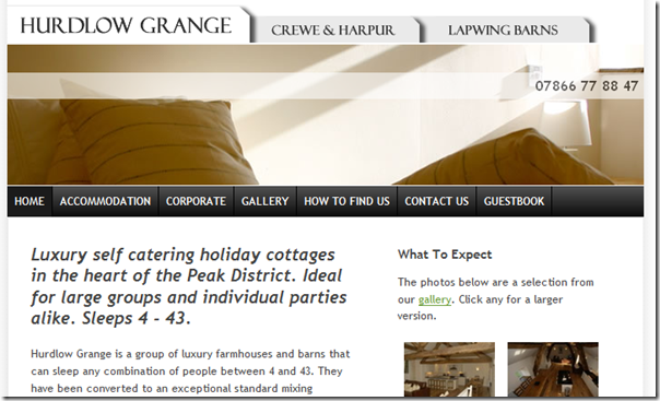
Recently I've been working on merging the websites for three self-catering properties - Hurdlow Grange, Crewe & Harpur Arms and Lapwing Barns. Owned by the same people, each had their own website, which made no mention of the other two properties.
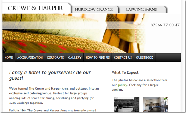
The aim of merging the three was to cross-sell them from each of the other sites. To do this I came up with the idea of each property being a tab, like so:

By clicking on the middle tab for the Crewe & Harpur you'd then go to that site. The middle tab would shift to the left (to assume the expected position of the main site logo) and the other two tabs would now become less prominent.

What worried me about this approach was that it broke the user's understanding of how a tab should work. If you press a tab it should stay where it is and becomes selected. Not jump to the left.
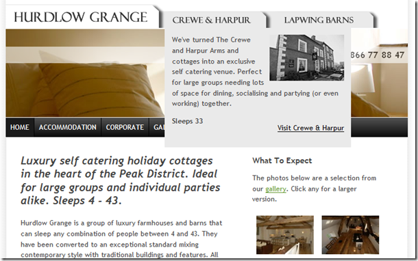
To try and get round this and to try and explain the tab in the first place I added a mega menu that goes some way to addressing these issues, like so:

Not exactly a "mega" menu, but the principle's the same - it doesn't have to be a simple list nested in your menu!
Adding A Little CSS3
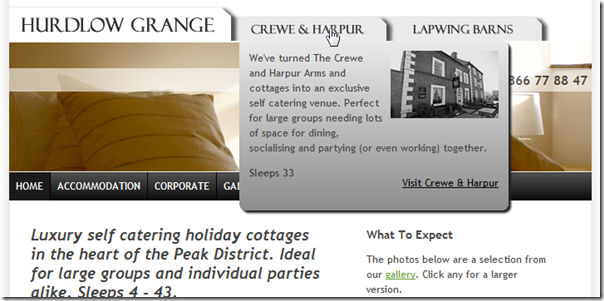
The screengrab above is taken in IE8. All works fine, but the CSS3 support is lacking. Compare it to the grab below, which was taken in Chrome:

Nice, no? Rounded corners. Background gradient fills. Drop shadows. And not a single graphic needed. The only difference between the two is about 6 lines of CSS.
So, there you go. You can make practical use of mega menus right now. You can also use a little CSS3 to add a that something special. Just as long as you check how it looks in non-CSS3 capable browsers too.
Cool! Is it mouse-over or click to show your demur mega-menu? thinking about usability... I mouse over and see it and click where I was aiming to click in the first place to head on over?
I think IE introduced :hover some time ago and it was eventually adopted into (pretty sure) CSS2. I know I was able to use it in IE 5 or 5.5 long before other browsers supported it, which was of course frustrating.
I didn't know CSS3 had added gradient support and rounded corners.... (and drop shadows??). Somewhat incredible!
Reply
"Is it mouse-over...?" Yes.
"and click where I was aiming to click in the first place to head on over?" Yes.
CSS3 has a lot of nice effects. But as Jake said, implementations of these vary per browser.
Reply
Show the rest of this thread
Cool, as usual!
I'm with Jerry, I didn't know it did that either. I guess I need to start looking into it more. But recently haven't really had the need, but am now interested in seeing what other changes there are.
Thanks Jake!
Reply
First, this is cool - thanks!
Second, why are rounded corners cool? Because they're harderish.
If they were easy, would we need them so much? I wonder.
Reply
Good question. Yeah, I guess a part of their appeal is that it's traditionally been hard to do (lots of DIVs and floats and images etc).
More than that though has to be that they look nicer, surely? Nature abhors the right angle, as they say.
If you gave me a length of wood and asked me to make a shelf, chances are I'd round the corners off with a sander.
Reply
A reference to the 50's - "don't be a square"
Reply
Very nice looking mega-menu. You can add CSS3 transitions and gradients to IE using CSS3 PIE at http://css3pie.com/.
I believe moving the tab will cause user confusion and that you ought to rethink the design.
Reply
I agree. It will cause user confusion. It confuses me and I made it.
The thing stopping me is that I think it's more important that the site's logo always appears on the left hand side.
The three properties each have their own domain name. Based on the current domain name it knows which site you're on and which tab to put first.
What I think I might do is look to see if the http_referer is one of the other domains. If it is then they must have clicked a tab. In those cases the selected tab can safely appear in the same place and act like a tabbed-website. If the user came from Google search or wherever then the site they arrived at has its logo on the far left. Hmm, more work...
Reply
Hi there
The drag and drop sorting facility is very interesting to me and could prove useful in some of our 'voice of customer' analysis when prioritising value proposition.
Could you explain the limitations of the software and how it might work - if at all - with other programs like Microsoft Office? How does it work within Lotus Notes? How can I send emails with draggable priority lists as attachments?
Many thanks in advance
Dave Wilkinson
Reply
Hmm. Not sure what you're talking about Dave.
Reply