Quick Tip: Make Your Forms Appear More Web 2.0
Anybody who has left a comment on this site recently might have noticed the form for doing so has changed ever so slightly. In line with the recent spate of changes I've made to this site I tweaked the comment form a little. Mainly I made the "body" field bigger, which I've been meaning to do for ages now.
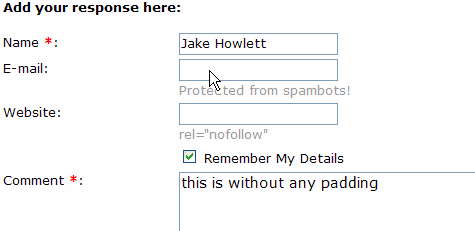
While I was at it I added some padding to the fields. Here's the form before adding padding:
And here's the form with some padding:
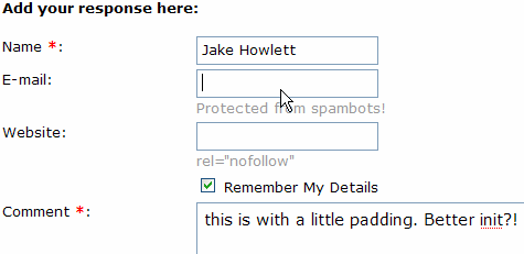
It's a subtle change but I hope you agree it has a beneficial effect? To me it just seems much nicer. You wouldn't have the text of the page butted right up next to the edge of the screen would you? Most text deserves a little white-space around it to make it easier to read. Input fields never have any padding though, which seems a shame.
Adding the padding is so simple I'm not even sure I need to say how, but here goes. Add the following to your master stylesheet:
input{padding: 2px;
}
textarea{padding: 5px;
}
From now on I think I'll make it a part of the global CSS of all sites I work on.
Jake, I like the changes. Just some suggestions:
- Make text fields (Name, E-mail and Website) wider so that we can see the entire Name while typing.
- Add <label> to fields, specially to the checkbox.
Cheers
Hi Marcos. Your wish is my command...
As we're talking about web-dev the following link might help some of us: {Link} (Top 10 CSS Table Designs - Smashing Magazine)
Nice one Jake....Funny how sometimes the simplest tips are the best.
I read this, and immediately set about adding padding to the thousands of fields I've written over the years.
The padding does make it easier to read. Other Web 2.0 resources you might want to read.
Web 2.0 is not a design aesthetic
{Link}
How to Size Text in CSS by Richard Rutter
{Link}
Styling form controls with CSS, revisited
{Link}
The Elements of Typographic Style Applied to the Web
{Link}
There are a few good links in the Richard Rutter article that are recommend reading. The most important tip I came away with from that article is "the importance of ensuring that the text on your page maintains a 'vertical rhythm'." It really makes the whole site more readable.