Creating Navigational Menu Arrows With CSS
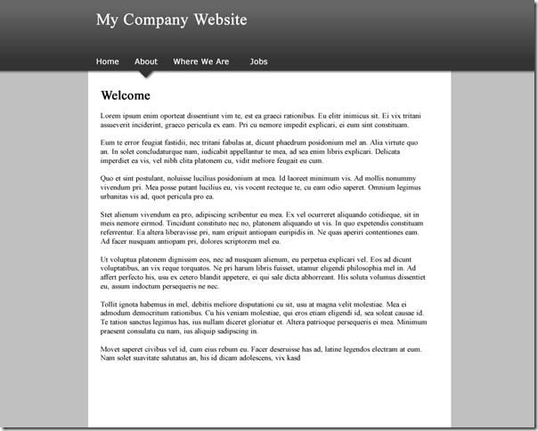
Yesterday we looked at the how, using Fireworks, we can create arrow-like images to add to our web site's main navigational menu. What we're aiming for is a site that looks like this:

Where the current menu item is highlighted by an arrow (ignore the fact it's on the wrong "tab" in the image above). To do this we exported three images from our Fireworks mockup, which look like this:
There's nav_li_bg.png  and header_bg.png
 ![]() and body_bg.png
and body_bg.png ![]() . That's all we'll need.
. That's all we'll need.
Creating The Webpage
The HTML for our page is structured simply like this:
<div id="container">
        <div id="header">
                <div id="navbar">
                        <ul></ul>
                </div>
        </div>
        <div id="content">
        </div>
</div>
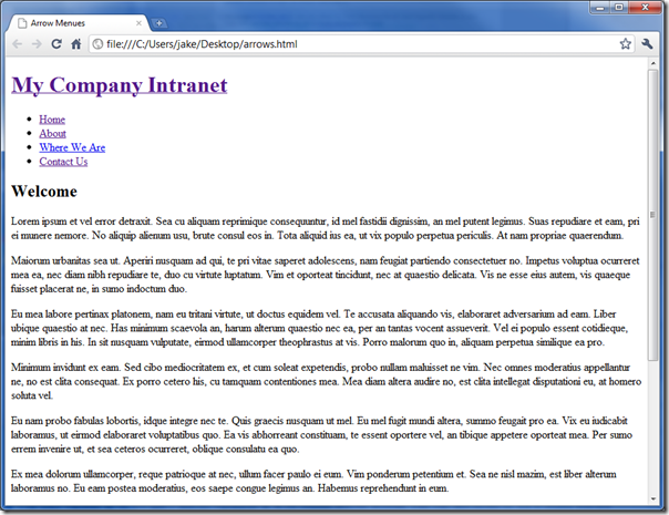
With some content in place, but no CSS it looks like this:

Now, let's start adding some CSS. First we're going to center the container and give the main body a background.
body{
        background:#C0C0C0 url(body_bg.png) repeat-x top left;
}

#container{
        width:829px;
        margin:0px auto;
        background-color:#fff;
}
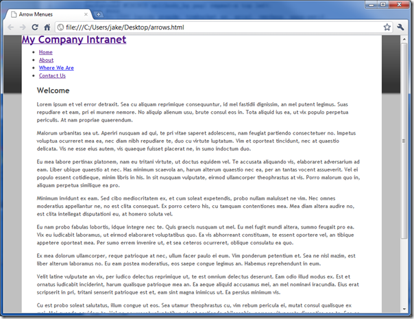
The page then looks like this:

Now we need to continue the dark grey bar across the page and align the header items. To do this we use the following CSS:
#header{
        padding:0px;
        margin:0px;
        height: 145px;
        background:#666 url(header_bg.png) repeat-x top left;
}

#navbar{
        overflow:hidden;
        position:absolute;
        top:109px;
        height:70px;
}

#navbar ul li{
        background:none;
        padding: 0 12px;
        list-style-type:none;
        float:left;
}
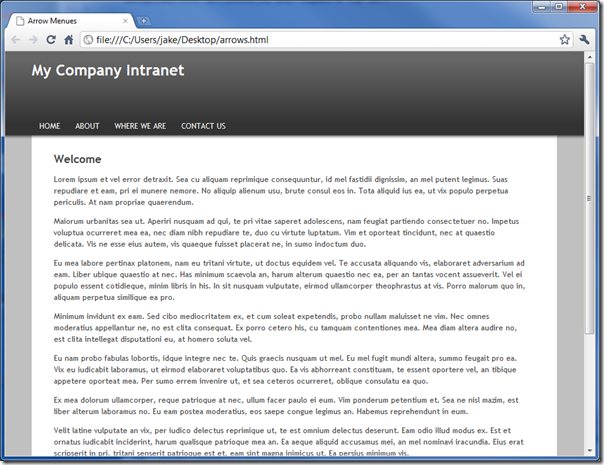
Notice the header has a fixed height of 145px which is the same height as the background repeater image we created for it. Notice also that we've positioned the navbar div using absolute positioning so that it sits at the bottom of the header div. I've missed a few bits out, but you can see all the CSS later. The site now looks like this:

All that's left to do is add the arrow to the selected list item in the menu. The HTML for the selected item looks like this:
<li class="selected"><a href="/">About</a></li>
Now, bear in mind that the background image we created looks like this:

The CSS we need to add to place this image on the selected link looks like:
#navbar ul li.selected a{
        background:transparent url(nav_li_bg.png) no-repeat scroll center bottom;
	padding-bottom:25px;
}
There are a couple of tricks in use. Firstly that we've aligned the arrow image with the bottom and the centre of the <A> tag. No matter how wide (or tall) the link is the fact the image itself is quite wide should mean the arrow is always in the centre. Even with a wider link the background of the header itself should bleed through. If not then just make the background image much wider.
The second pivotal trick is to add some extra padding to the bottom of the selected link. This pushes the background image downward, as it's aligned with the bottom of the link tag, while leaving the actual link text where it needs to be. That's all there is to it really. Just one clever little trick to make the selected link appear taller than the others.
The height of 25px isn't some magic number. It just happens to be the height needed for the image I created. In practice getting everything to align properly is a matter of trial and error while notching the height up and down a few pixels at a time. A bit fiddly, but worth it!
You can see the final HTML page here and you can download the necessary CSS from there. Happy styling!
For you Domino lovers, sorry it's not in an NSF file. You'll just have to work that bit out for yourself.
On the subject of menus, Nettuts earlier this week published a "how to" on how to create super menus. Fully cross platform and really rather nice.
http://net.tutsplus.com/tutorials/html-css-techniques/how-to-build-a-kick-butt-css3-mega-drop-down-menu/
Reply
Yeah, I love mega menus and wish I had (or had worked on) a site I could use them on.
Earlier this week I saw a link on Twitter to "50 examples of mega menus" or something like. Was going to dig it out but see the page you linked to above already has them linked at the bottom of it.
Reply
Oh yes, this will be useful in 5 or 10 years when 80% of the browsers in use support CSS3. In the mean time ... it's lowest common denominator for me.
Reply
Show the rest of this thread
I guess I should have puzzled it out without looking with firebug, but now I understand the li clips the arrow bg image so you don't need to do any special handling there. I had thought originally it would spill over onto the body background. Simple and effective and not a lot of CSS. Thanks for sharing!
Reply
This is a nice simple solution but also highlights what I don't like about the use of CSS and graphics on web sites; complex dependencies.
When writing software the more complex the interactions between different parts of the code the harder it is to debug and/or change. That's the argument against too many global variables and goto statements.
Let's enumerate some of the interactions in your simple example that must be considered if you wanted to make changes to this design.
GRAPHICS
If the customer wanted you to change the color scheme of this design what would you have to do?
1. Recreate the three graphics elements with the new colors.
2. Change the CSS body tag background color. This value has to match the bottom part of the header_bg.png graphic to blend with the left and right border panels. (I think that's right.)
3. Change the CSS #container tag to adjust the center main content background color and this has to match the bottom color of the header_bg.png graphic.
4. Change the CSS #navbar tag to match the top of the header_bg.png graphic.
The use of absolute positioning for the menu text also means that any change in the height of the header section requires and adjustment to this parameter too. This happens to me all the time when I add a photo or other graphic to the header that was taller than I expected.
I've been struggling with all these factors for several years so I really appreciate your attempt to illustrate a simple solution. I do like that the HTML li.selected tag clips the background graphic. I didn't know that so I'll try that out.
But for me this is still more interaction between these elements than I would like. I'd like to be able to change these things through a web interface and I don't really want to have to automate the generation of graphic elements automatically.
Before XPages I've experimented with dynamically generating the CSS with math to control absolute positioning. This way I could keep all the logic for calculating where things were placed in one piece of code. But it wasn't very flexible so I had just moved the problems to another place.
What has really stopped me, though, is the need to accommodate the various differences between how browsers render HTML and CSS. I just can't afford to try to keep up with all the changes and discoveries that affect this.
Peace,
Rob:-]
Reply
Hi Rob,
I've bounced this same problem around to a couple of different places with different solutions. I think using configuration data to drive appearance is a great approach. It adds a bit of complexity but it addresses your first hurdle - touch-point dependencies. At least with configurable data, you're down to editing a list of keywords or values on a single document.
The bigger problem, as you alluded to, is where do I punt my cross-platform issues to? Do I use flex/flash and punt to the plugin? Do I try to use browser side libraries like dojo and punt tot he pre-packaged server code?
I don't think there's a perfect answer. I do think there's the narrow path approach though. Choose the best platform for the need, choose the best approach for the application. If it's a template you're going to roll out again and again, writing a HTA ( http://msdn.microsoft.com/en-us/library/ms536496%28VS.85%29.aspx ) to generate your style sheet for you each time is no big deal (assuming you're just doing text and graphic files with no data). A more complex version of this could be done with Domino or ASP.NET. Then you get into 'fitting the need'. Again no perfect solution but you pick the best fit.
While there's been lots of effort to standardize the web, there will always be competitive product differentiation, early adopters and emerging trends and technology upsetting the cart. We'll never have a unified approach that reduces everything to a neat configurable package with a minimum of fuss that has universal adoption. We might see wide adoption of certain technologies and methods, but thank God, you and I have a job because nobody can agree on the best way to get things done with IT. :-)
Reply
I agree, in part. It would be nice not to need to fix the absolute position of the elements. But, in the real world, is this such a massive issue?
In my experience site designs rarely (if ever) change once they've been approved and made live. I can't think of any site design I've changed after the fact following a request by a customer. If ever I did need to then we're only talking about a ten minute job and a bit of fiddling.
Reply
Hey Jake ,
Off topic question.. Have you tried writing event handler in SharePoint list/library ? Would be great if you come up with step to step article..
Thanks,
Rishi
Reply